Creating a banner for your business can significantly boost your brand's visibility, attract potential customers, and communicate your message effectively. Whether it's for a physical store, a trade show, or an online presence, a well-designed banner can make a strong impression. Here’s a comprehensive guide on how to make a banner for your business.
To begin, think of your company's print banner like you would any physical advertisement; it needs to quickly attract eyeballs and simultaneously convey your message. That’s the easy part; in the crowded advertising landscape, the hard part is figuring out how to design a banner that will stand out and entice your target audience. The "right" banner can drastically improve your advertising and marketing.
Banner design is easier than you think, if you break down the process into steps.
- 1. Types of Print Banners You Can Use
- 2. Figure Out Where You’ll Be Showing Your Banner
- 3. Figure Out Your Message
- 4. Elements Every Banner Should Have
- 5. Choosing Your Graphics and Images
- 6. Choosing a Font Style and Size
- 7. Create Visual Contrast
- 8. Focus On Layout
- 9. Proof and Print Your Banner
- Build Your Banner Today
1. Types of Print Banners You Can Use
Before you start going through the process, it’s important to know the different types of banners that are available. As you’ll see below, there’s a wide range of different banner types to choose from, and each one has unique traits.
- Vinyl Banners
- Durable and weather-resistant
- Ideal for both indoor and outdoor use
- Available in a variety of sizes
- Easy to clean and maintain
- Mesh Banners
- Made from perforated vinyl material
- Allows wind to pass through, reducing strain on mounting points
- Perfect for outdoor use in windy conditions
- Great for large-scale advertisements
- Fabric Banners
- Made from polyester or other fabric materials
- Lightweight and easy to transport
- Offers vibrant color reproduction
- Suitable for indoor events, trade shows, and retail displays
- Retractable Banners (Roll-Up Banners)
- Portable and easy to set up
- Retracts into a base for compact storage
- Ideal for trade shows, conferences, and temporary displays
- Often comes with a carrying case
- Hanging Banners
- Designed to be suspended from ceilings or structures
- Great for events, trade shows, and retail environments
- Available in various shapes and sizes, including vertical and horizontal
- Can be single-sided or double-sided
- Pole Banners
- Mounted on light poles or street poles
- Used for city-wide promotions, festivals, and events
- Weather-resistant and durable
- Often seen in urban areas, campuses, and along streets
- Step and Repeat Banners
- Features a repeating logo or graphic pattern
- Used as a backdrop for photo opportunities
- Commonly seen at events, red carpets, and press conferences
- Typically made from fabric or vinyl
- Backdrop Banners
- Large banners used as backgrounds for stages, photo booths, or exhibitions
- Provides a professional and branded environment
- Available in various materials, including vinyl and fabric
- Customizable sizes to fit specific needs
- X-Banners
- Lightweight and portable with an X-shaped frame
- Easy to assemble and disassemble
- Suitable for indoor displays and promotional events
- Cost-effective and reusable
- Tension Fabric Displays
- Uses stretchable fabric to create a smooth, seamless look
- Ideal for trade shows and exhibitions
- Lightweight and easy to transport
- Provides high-quality graphics and vibrant colors
2. Figure Out Where You’ll Be Showing Your Banner
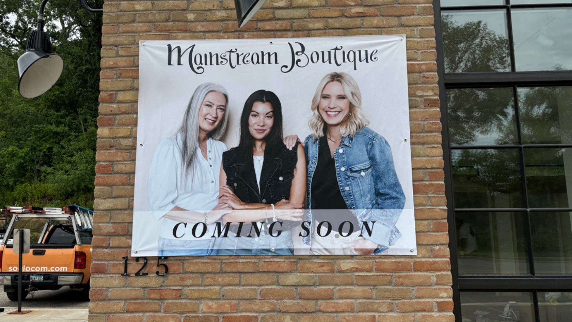
Now that you have an idea of what type of banner you’ll be using, it’s time to start thinking about where you’re going to place it. Do you plan to use it as a storefront banner? Will it be used at a trade show booth? Are you using an outdoor banner for an event?
Knowing the exact placement of your banner will help you as it pertains to your banner design, color, material and message. When choosing colors, consider the background of where it’ll be displayed. For example, if you intend to hang your banner on a wooden fence, you don’t want to use a banner that has neutral colors. In this scenario, a white background will show better.
3. Figure Out Your Message
The message you choose is key to the success of your banner. Be sure to take your time and carefully think about the message you want to use. What action do you want people to take after seeing your banner? (Your CTA, or “Call-to-Action,” should reflect this.)
Most experts recommend a short, precise message. To be effective, the banner's message should get straight to the point. For example:
- “Delivery is now FREE”
- “Office space for rent”
- “Grand Opening”
- “25% off entire selection”
- “BOGO - Buy One, Get One”
If you plan to use your banner outside your business location, include your company's name and/or logo, making sure that they're easy to pick out from the text. You should also think about adding a phone number or website URL. If you have more to say, use this as an opportunity to send them somewhere for additional information. You could have a unique URL that you can share for more information versus just using your homepage URL.
If your company has been running marketing campaigns, look for anything relevant (graphics, images, slogans, etc.) that connect past marketing themes with your current campaign.
4. Elements Every Banner Should Have
A well-designed banner should include the following elements:
- Headline: A catchy and concise headline to grab attention.
- Subheadline: A brief subheadline to provide additional context.
- Call to Action (CTA): Clear and compelling directive, such as “Shop Now,” “Learn More,” or “Visit Us Today.”
- Contact Information: Include your website, phone number, and social media handles.
- Visuals: Relevant images or graphics that support your message.
5. Choosing Your Graphics and Images
Your custom banner design's message may not require an image, but sometimes, a graphic or picture can be the best way to make a point to your audience. If you're using a graphic/image, make it simple and obvious. Any graphics or images used should have clean lines and few colors.
Consider using graphic design for products or services you're promoting. For example, if you are introducing that you now offer hot wings, an image/graphic of hot wings clearly emphasizes the message without the viewer needing to remember your text. If a person sees just the image/graphic, they’ll know that you now offer hot wings.
6. Choosing a Font Style and Size
A print banner aimed at pedestrians or drivers should be quickly and easily understood. To ensure your banner is legible from a distance, choose a classic and clean font. We recommend sticking to one or two font styles. A mix of different typefaces can distract from the story, and you don’t want that.
If you decide to use two fonts, choose two from the same “font family.” One of the most common font styles used is Arial. Arial Narrow, Arial Light, Arial Classic, and Arial Bold usually pair well together. If you need help with font styles, we’re always here to help.
Let’s talk about font size. Readability is one of the most important things to consider when choosing a font size for your banner. Even if people can walk up to your banner (such as a standing banner at a trade show or a window banner in your store), the font size should still be large. Your banner might contain clever lines, but if the font is too small, no one will be able to read it. Use all caps to emphasize specific words or if your text is short enough.
7. Create Visual Contrast
Visual contrast is extremely important if you want your banner to grab attention. If someone is driving or walking by your storefront, they won’t notice your banner unless it stands out from its environment. Bright colors can attract attention, but you want a contrast of colors to make your banner pop. Some of the best business banner ideas consist of just two colors that work great together, one color for the text and one color for the background.
Think about using these combinations:
- A bold font that contrasts with an eye-catching background color, like red, yellow or orange
- Black text on a white background or vice versa – a classic combination that still works great today
- Blocks of color (ideally in a color identifiable with your brand) with white text over it, creating a focal point
You can play around with color combinations; just make sure the text is readable from at least 10-15 feet away.
8. Focus On Layout
Next, you want to think about the format or layout. Some of the best banner design ideas include an uncluttered layout with few images. If you have a lot of things going on in your banner, potential customers may glaze over it.
To begin, decide if your banner is going to be vertical or landscape. You can use a landscape banner if you plan to hang it on a wall (indoor or outdoors). You could go the extra distance and use window and wall graphics too. When it comes to tips for landscape banners include:
- If you have only one line of text, center it and leave a border of white space on all four sides.
- For two or more lines of text, consider center-aligning the content and including a border of white space. Reduce the font size for the second line if that information is less important.
- You can use longer text if your banner will be used inside where people have a chance to stop and read it.
If you plan on using vertical banners, less text is the better option. Think about a store having a clearance sale; you'll likely see vertical banners hanging from their ceiling that say nothing more than “SALE” in a white font over a color background. It’s very effective.
9. Proof and Print Your Banner
Wrapping up this guide on how to make a banner for your business, the last step before printing, you just want to ensure your design is proofed and ready to go.
- Proofreading: Check for any typos or grammatical errors.
- Color Accuracy: Make sure the colors are accurate and match your brand guidelines.
- Print Quality: Choose a reputable printing service that offers high-quality materials and printing options (like SOULO!).
Build Your Banner Today
Here at SOULO, we’ve designed hundreds of banners for companies and have an amazing creative and print team ready to help.
SOULO is a full-service marketing and communications agency that helps client partners get the most from their projects through signage, printing, and digital marketing. Ready to get started? Contact us today!
