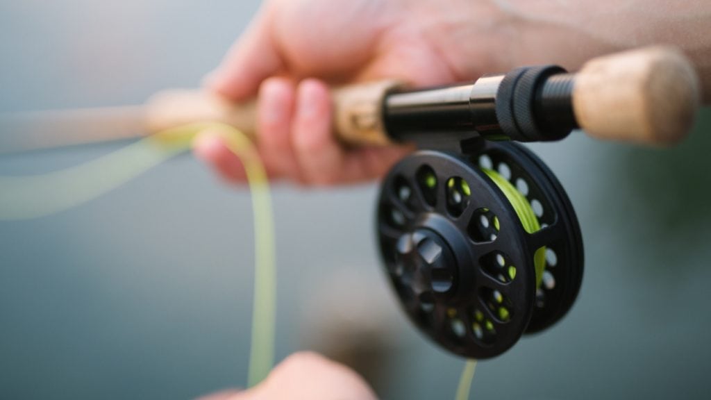
Not savvy on fly fishing? Here's a quick run-down. Fly fishing is a sport in which you fish with a fly, a small hook with fur, feathers, or other materials fastened to it. The propulsion of your offering to the fish in the water comes from the weight in the line, not the fly. The fly is often feather light, which allows for a more delicate and often more realistic presentation as opposed to traditional plastic baits and lures.
How is fly fishing similar to Web design?
As with Fly Fishing, there is often a certain mysticism about web design. People see a beautiful end result, without knowing the the reasons for why some things are done certain ways. In the eyes of many, the fly cast is often viewed as a mysterious art form. When performed properly, they fly cast is beautiful to behold. The caster seems tied to the rhythmic loops, gracefully gliding through the air, pulling out line as the fly eventually reaches its destination on the water.
There is a purpose behind the beauty. Each successive loop puts pressure on the rod, which then bends and stores the energy given from the fly line. The rod unloads the stored energy, delivering the line forward to its target audience... the fish.
Web design can be thought of in a similar way. Built properly, a website delivers an attractive interface with a seamless delivery of content and navigation. The user can easily find what they are looking for without much thought, all the while enjoying their experience, possibly in awe of the visuals on display. They are now hooked.

Choosing the correct fly is like choosing the correct target audience.
When it comes to fly fishing, there are hundreds of flies to choose from. How do we choose which fly to present to the fish? Do we pick the most beautiful looking one? No... that may not be what the fish are biting today. We can cast and cast without so much as a bite for hours. The fly might look great, but what's the point if we are not getting bites? We need to do some research and figure out what the fish are eating. Then we pick a fly that closely matches their appetite today. After that we add a little extra such as a calculated placement to make it stand out in the vastness of the water column.
A beautiful website not properly thought out can be much the same way. It looks good, but who is it for? Planning for a specific target audience will lead to more meaningful traffic on your website. A big beautiful splash image taking up the entire screen may look nice, but what is it like for your user? If you have an art or photography website, this large splash image can go a long way in setting a mood for people using your website.
This same methodology may not be conducive in an application such as an auto parts website. Lets pretend the user in this situation is looking for a specific part or piece of information, and they are in a hurry... as most people on the internet usually are. This user is not going to wait for that big image to load. They are not going to spend time figuring out that creative navigation system. That's not what they are eating today. They need to order that part now as their car is useless without it. They want to get from A to B, and hopefully, they want to give you their business!
Changing flies mid-day to match the hatch.
Sometimes, the fly that has been producing well suddenly stops working. There is probably a new insect hatch going on. The fish have moved their focus to this new fly hatch. The fly you have tied on no longer looks appetizing to the fish. At this point you need to adapt. Hopefully you have been doing research and knew that come mid-afternoon, a caddisfly hatch would be in full swing.
As with fish, your user's appetite for content can change. Ongoing data monitoring on your website can give you clues on how to present information. You may have anticipated a drop in traffic for a specific section of your website. Given this knowledge, a calculated layout change can be implemented to keep that traffic flowing and keep 'em biting.
Happy fishing!.. Er, web designing!
